
Redesigning a learning tool for today’s language students
Redesigning the experience to make learning more engaging, connected, and user-friendly.
")
My role
UX Designer
Platforms
Web (Desktop)
The team
Business analyst, Project manager and our client's business and development teams.
About the client
A Brazilian language school with over 40 years of experience teaching English and Spanish. With around 400,000 students across 600 schools, it ranks among Brazil's top 50 franchising networks, and its mission is to educate and contribute to a better society.
With a strong commitment to social impact, the school's mission is to educate and empower people, contributing to the development of individuals and a better society through accessible and high-quality language education.
The school's methodology combines face-to-face and online teaching, along with technological resources that insert the language into the student's daily life.
The Challenge
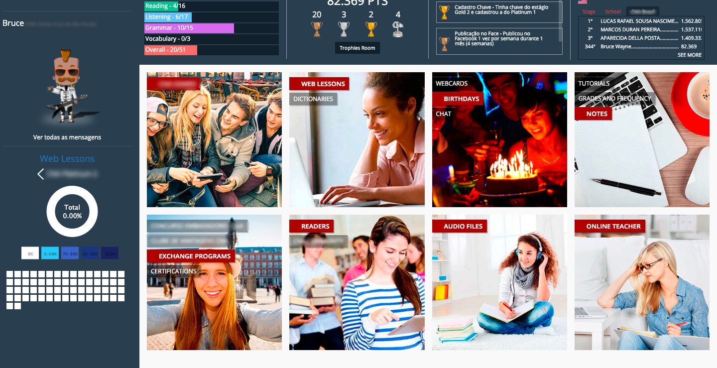
One of these technological resources is a platform that allows students to perform online lessons, ask questions to teachers, and see their grades. However, our customer was not satisfied with it, since the product was developed in 2014 and had a lot of issues, such as:
- A non-responsive User Interface, which had a big impact on mobile usage.
- Several usability issues, transforming simple tasks into hard ones.
- Outdated technology and infrastructure, compromising the website speed and availability.
- And the biggest one: a generic solution intended for all user groups but falling short for everyone.
The Design Process
To understand our users, what were their pains and provide a consistent solution, we divided our process into 4 steps:
1. Discovery
2. Definition
3. Ideation
4. Design & Testing
1. Discovery
We were able to use several methods to gather data about our users and try to understand their problems better
CSD Matrix
The CSD Matrix was the very first step we took at the project. It is a tool used to get rid of assumptions, pointing - from the start - what your Certainties, Suppositions, and Doubts are.
They serve as a guide throughout the project, especially for the research part.
Stakeholders Interviews
We did interviews with stakeholders, including internal (Client's management team, technical team, and teachers) and external (children and their parents/legal guardians, students)
This step was essential for our team to begin to identify some user's pains and concerns. We could learn about their routine and how they used technology in their everyday lives. It helped us understand more about the business of teaching a foreign language.
Online Survey
To complement interviews data, we decided to use an online survey to reach more people, considering we had users from different parts of Brazil and a limited time for the project.
After some days of running the survey, we collected 368 answers. With those answers, we could analyze all the data and relate it to different user characteristics, like age, for example.
With that data, we learned more about users' motivation when doing language courses and what were their thoughts on the product.
Quantitative Data Analysis
The old version of the product had a Google Analytics account set up and a User Database, so it was easier to find data that could help us understand more about our users and some of their behavior. We could learn:
- How was the Male/Female proportion
- Which age group had more users.
- Which part of the country was more active
- Which hour of the day the product was more used?
Competitive Benchmark
Lastly, we looked out for the market to see other products. That helped us identify what worked best in terms of features and usability and especially what didn't work very well. Along the way we analyzed the following apps:
- Duolingo, for its well-known approach to language education, including gamification techniques.
- Babbel, for being another strong player in the education segments.
- Edmodo, due to the way it connects students, teachers, and parents. Also, learning how Edmodo dealt with children's privacy was a big challenge for us.
- Khan Academy, especially because we wanted to learn how it complements online and face-to-face education.

2. Definition
We synthesized the insights collected during discovery to identify key patterns and define user profiles that would inform our next steps.
Affinity Diagram
We also had a lot of unstructured data collected from different sources and spread over different places, from notebooks to Evernote.
So, in order to identify all the data we gathered, we organized all the data into some clusters. After that, we got the following groups:

Personas
With all the information we collected, we were able to build the first version of our personas. Initially, we created three distinct personas, each representing a different type of student:
- Luiza (13, student – São Paulo) - Very connected to social apps and YouTube, but often distracted during tasks and struggles to balance tech use with studies.
- Pedro (9, student – Belo Horizonte) - Loves games like Minecraft and YouTube, but needs more motivation and structure to stay focused while learning.
- Helena (23, university student – Curitiba) - Has limited time, prefers flexible online learning, and feels insecure when practicing speaking in English.

3. Ideation
Brainstorming Session
After we finished the Discovery and Definition steps of our UX process, we had a better idea of what problems our users had. So, we decided to hold a brainstorming session with our clients. In order to begin the ideation process, we reviewed all of our discoveries and our personas and created some hypotheses after the problems we found.
One of these problems was the fact that the product seemed to be extremely loaded with information considered useless by the users. This case was even more serious when we talked about children, whose main problem was having to use a product with features intended for both adults and children.
Based on that and other major issues discovered along the way, we decided to split the product into two versions: one dedicated to young kids, focused on bringing fun and ludic elements into the education process, and the other one focused on teenagers and adults, focused on bringing social elements.
4. Design & Testing

Prototyping and UI Design
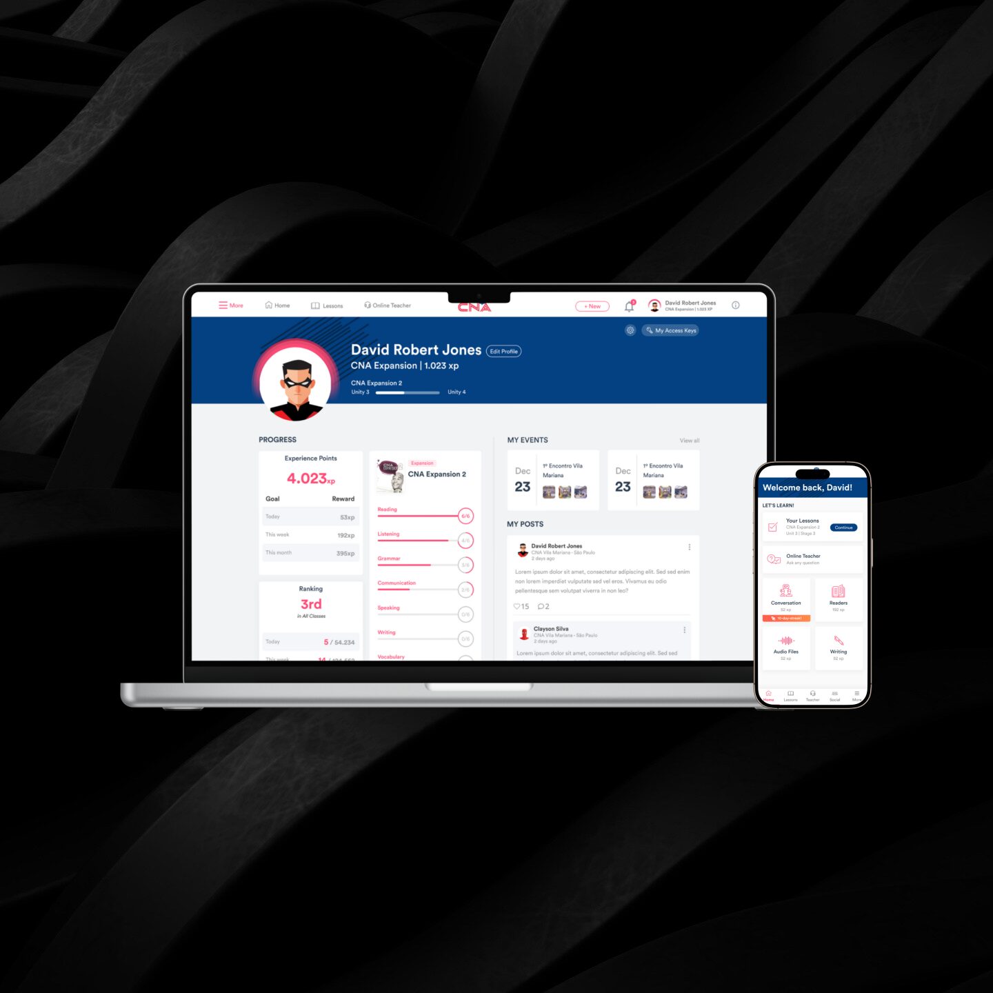
After our research, we knew that most of our users (even the younger ones) had mobile phones as one of their most used devices. So, using mobile-first was essential to our User Interface creation.
While the interface for the younger users was more focused on playful elements, the product for older users had an interface based on known elements from social media and learning apps.
For this step, we started with some sketches and ended with a prototype built in Figma and running on Marvel App. You can see some screens (for both web and mobile versions) below:

Testing
After prototyping the interface of our product, we ran some usability tests to identify where our UI could improve and possible usability problems that would probably affect the user experience. We held 3 usability sessions:
- A face-to-face and moderated test with 16 users for both mobile and web versions. Although we had both teenager and adult users, the majority of users were kids between 8-12 years old.
- A remote and moderated test with 10 users for the web version. While the focus of our first session was kids, we focused exclusively on teenagers and adults, who would be using the "grown-up" version of the product.
- A remote and unmoderated test with 19 users for both mobile and web versions. For this session, we used a tool called Maze. Besides creating the test for the users to replicate on their own devices, it could generate a heatmap and statistics about which path users decided to take when using our product.
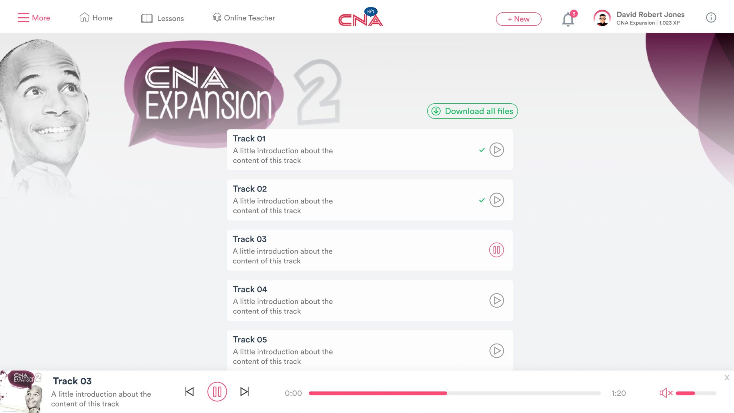
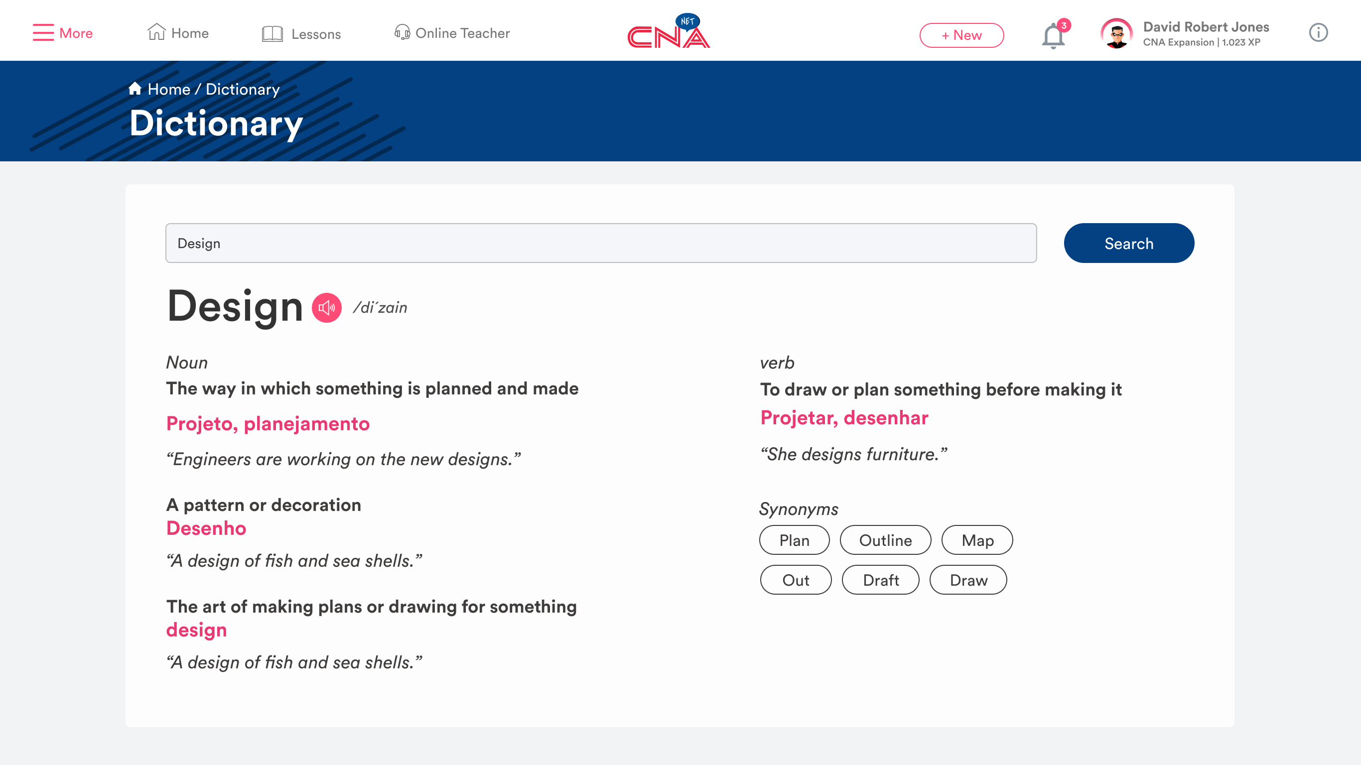
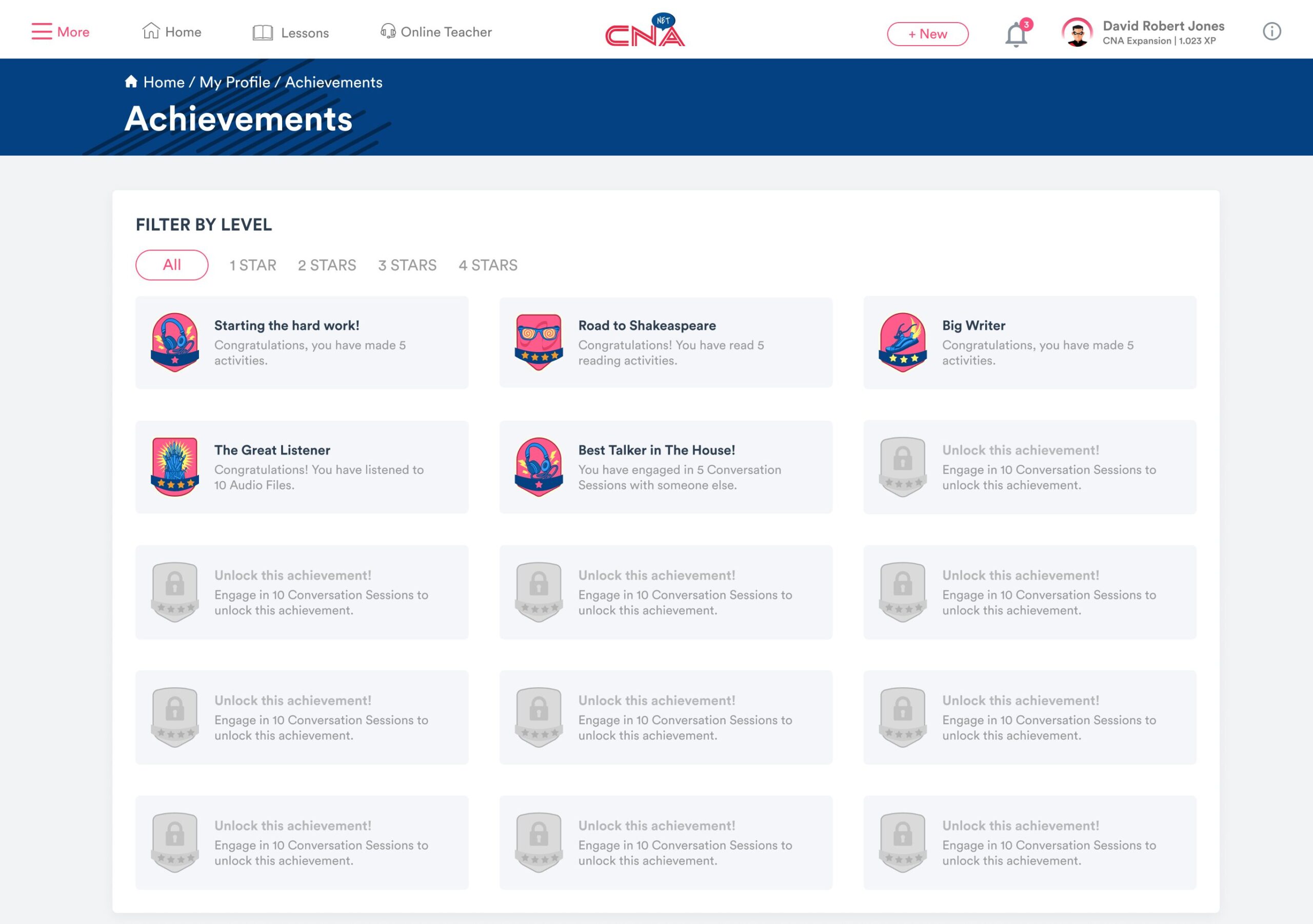
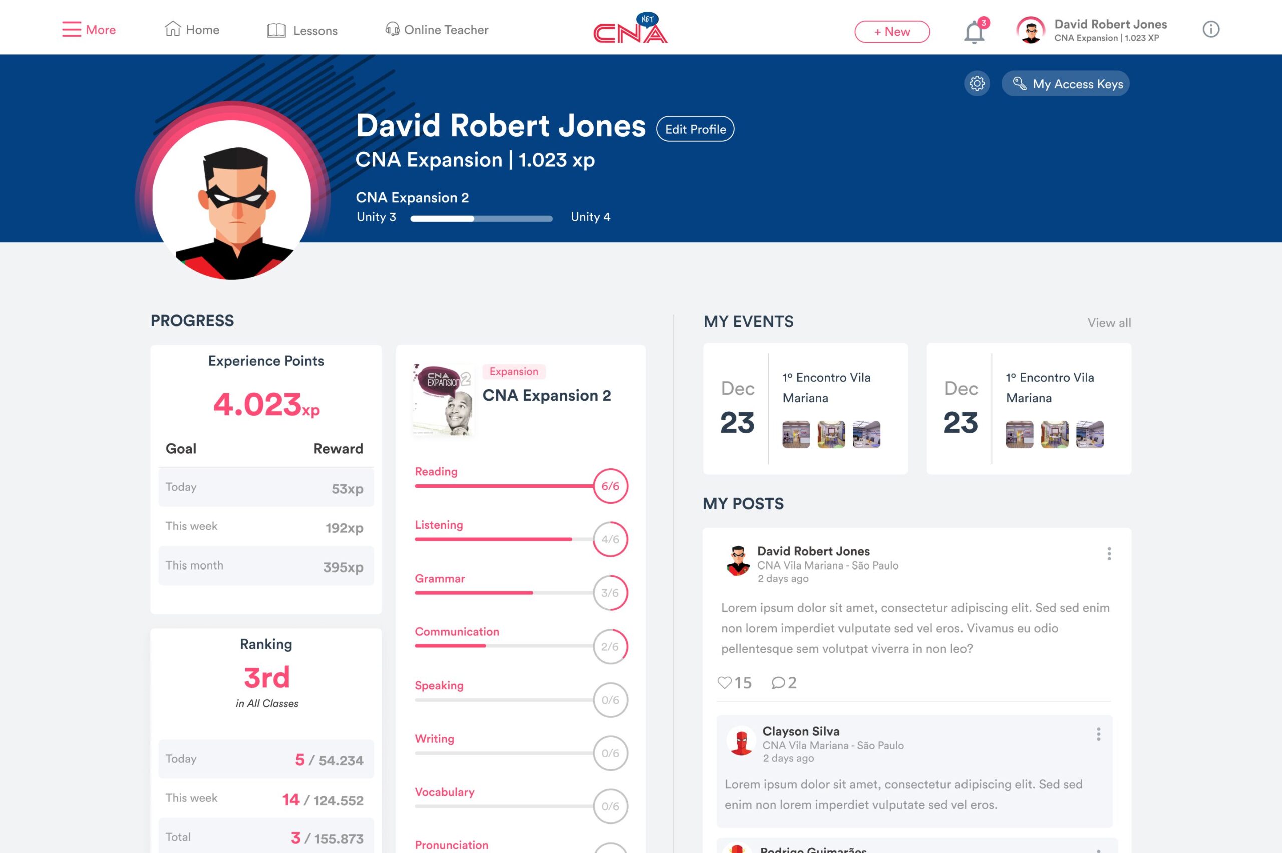
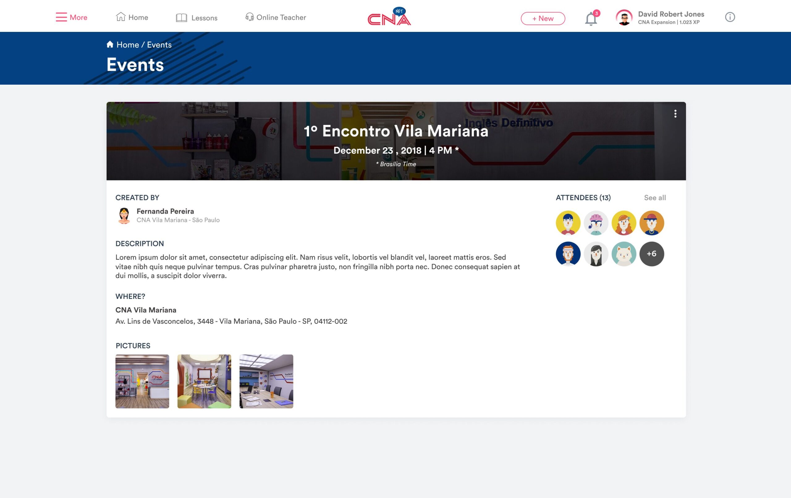
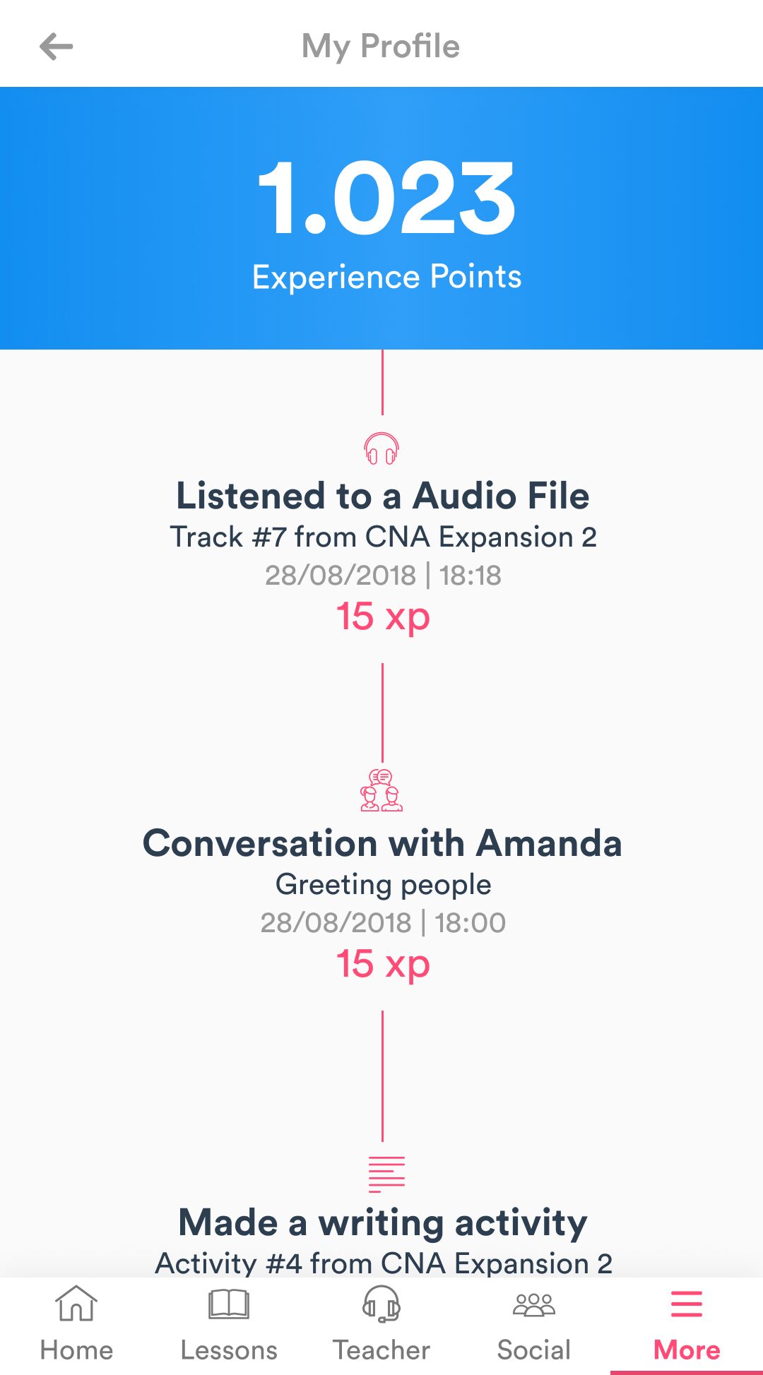
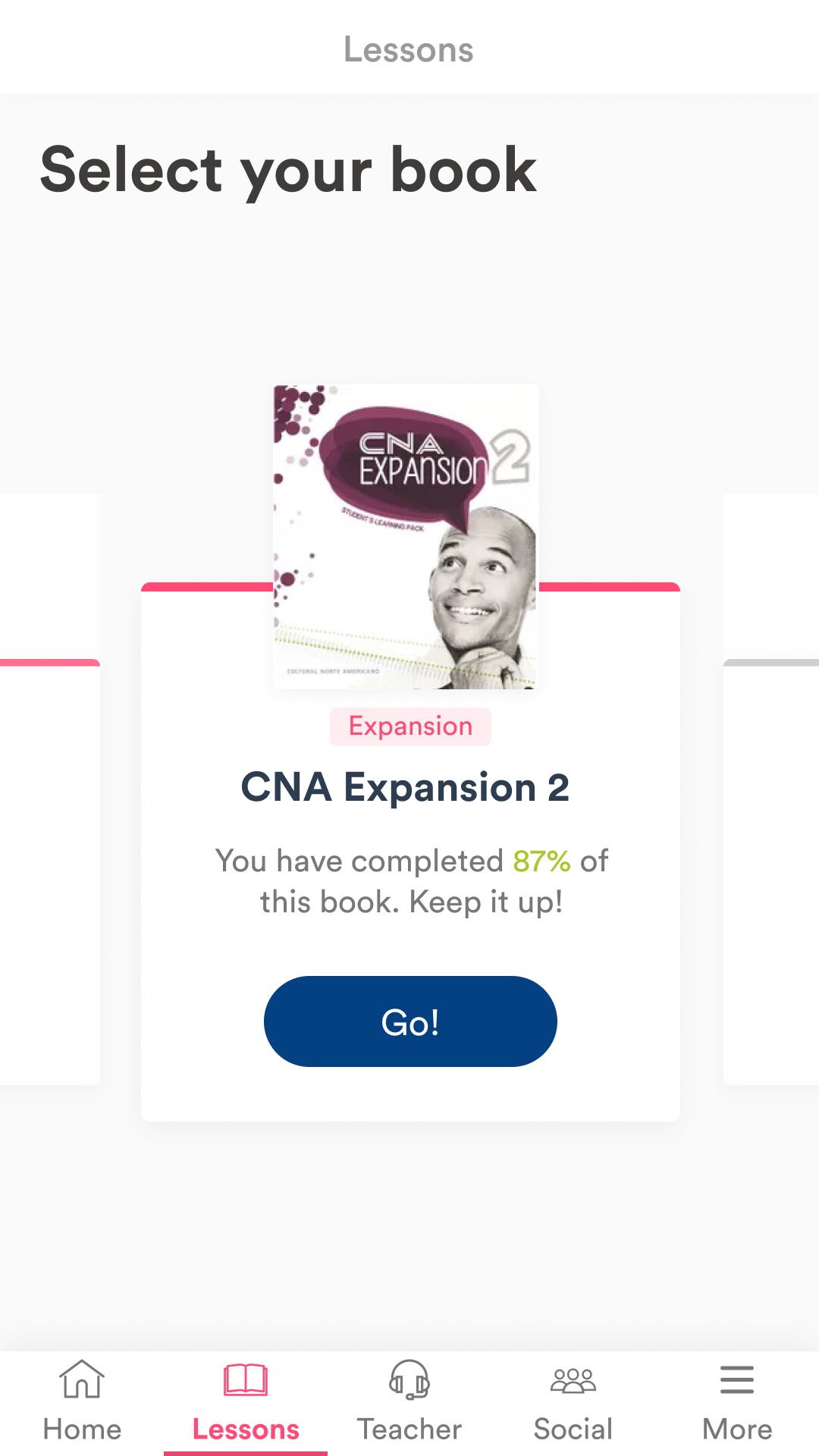
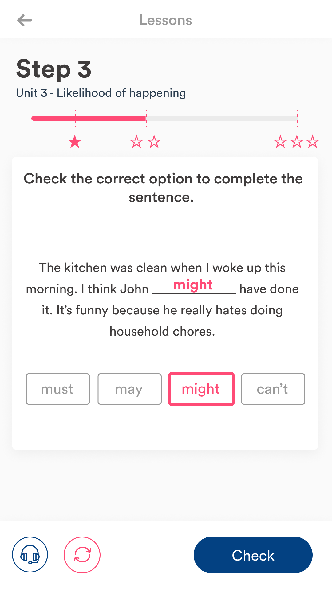
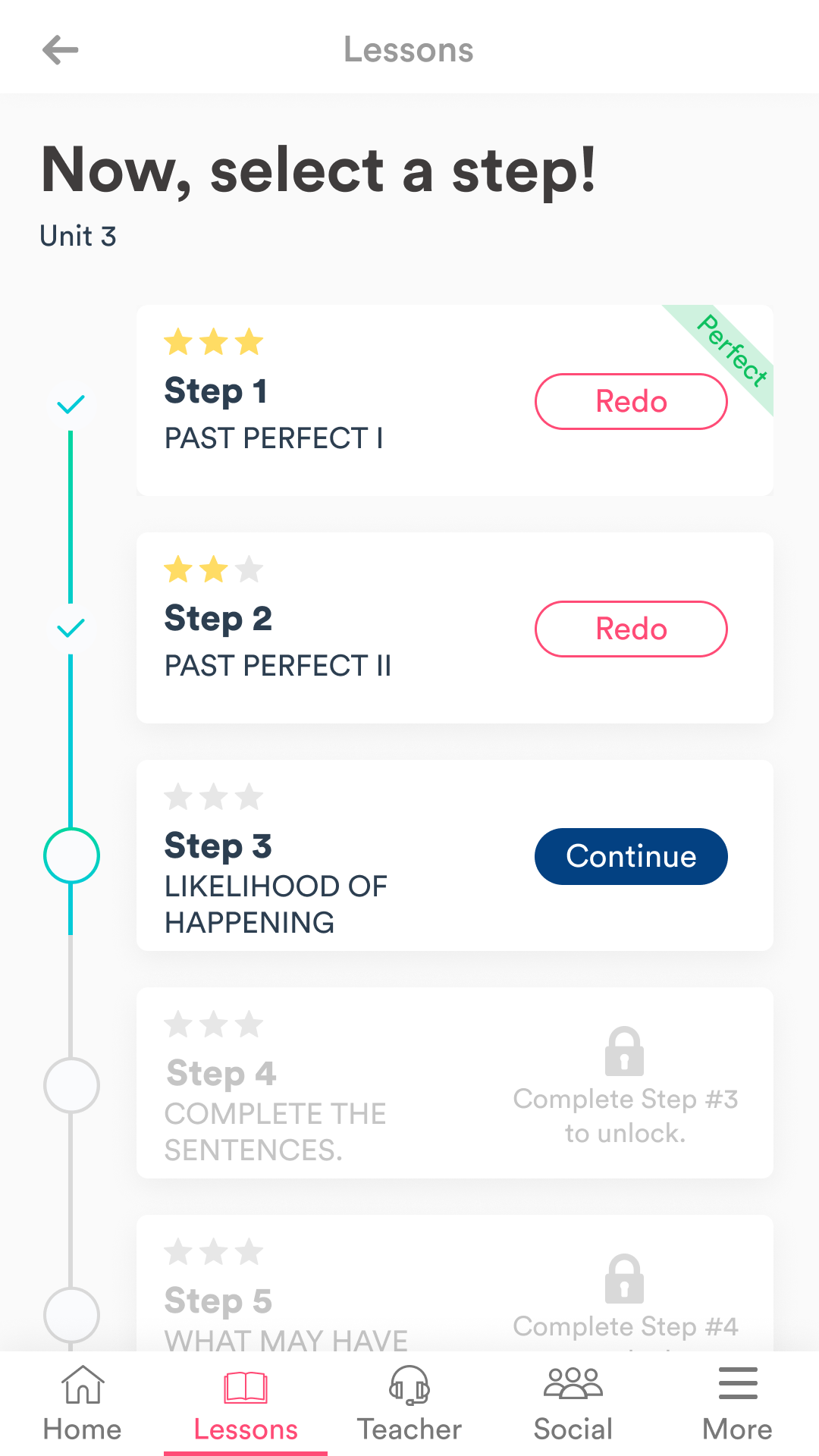
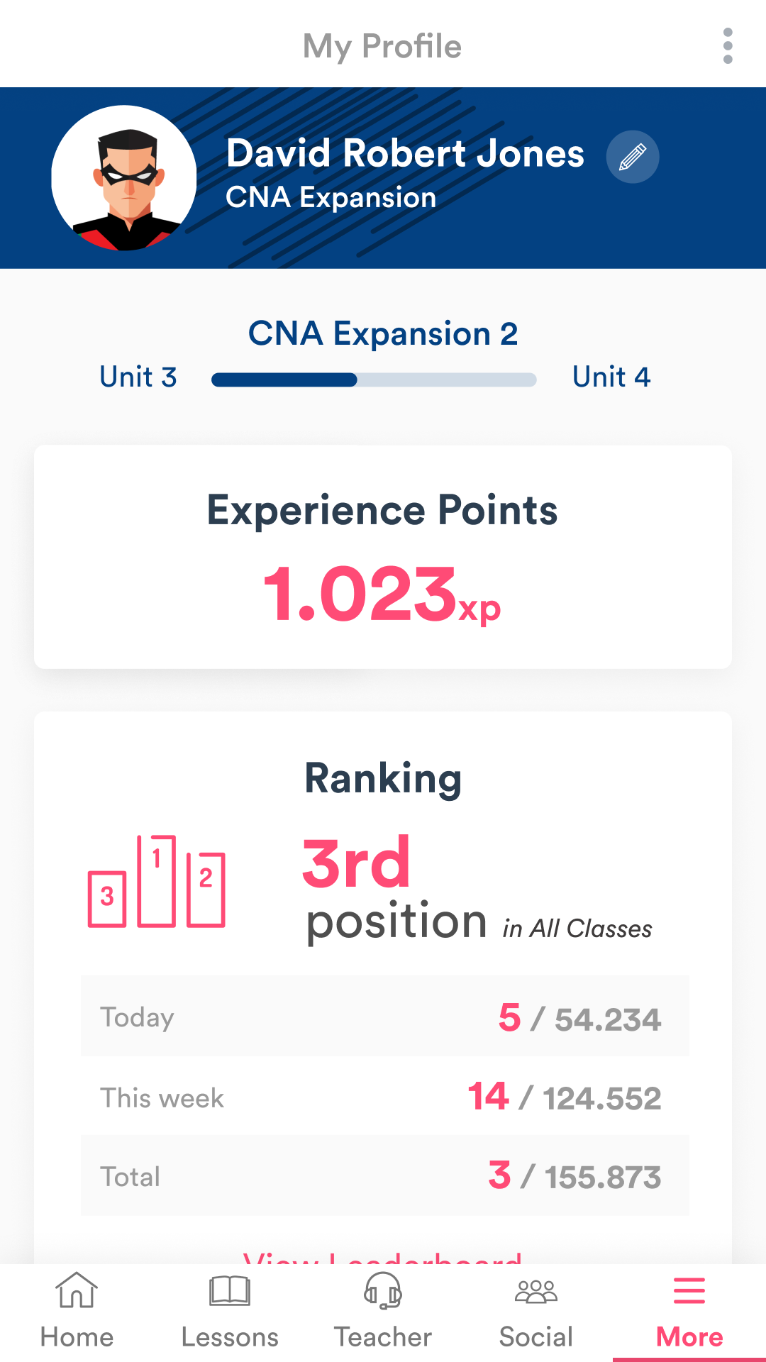
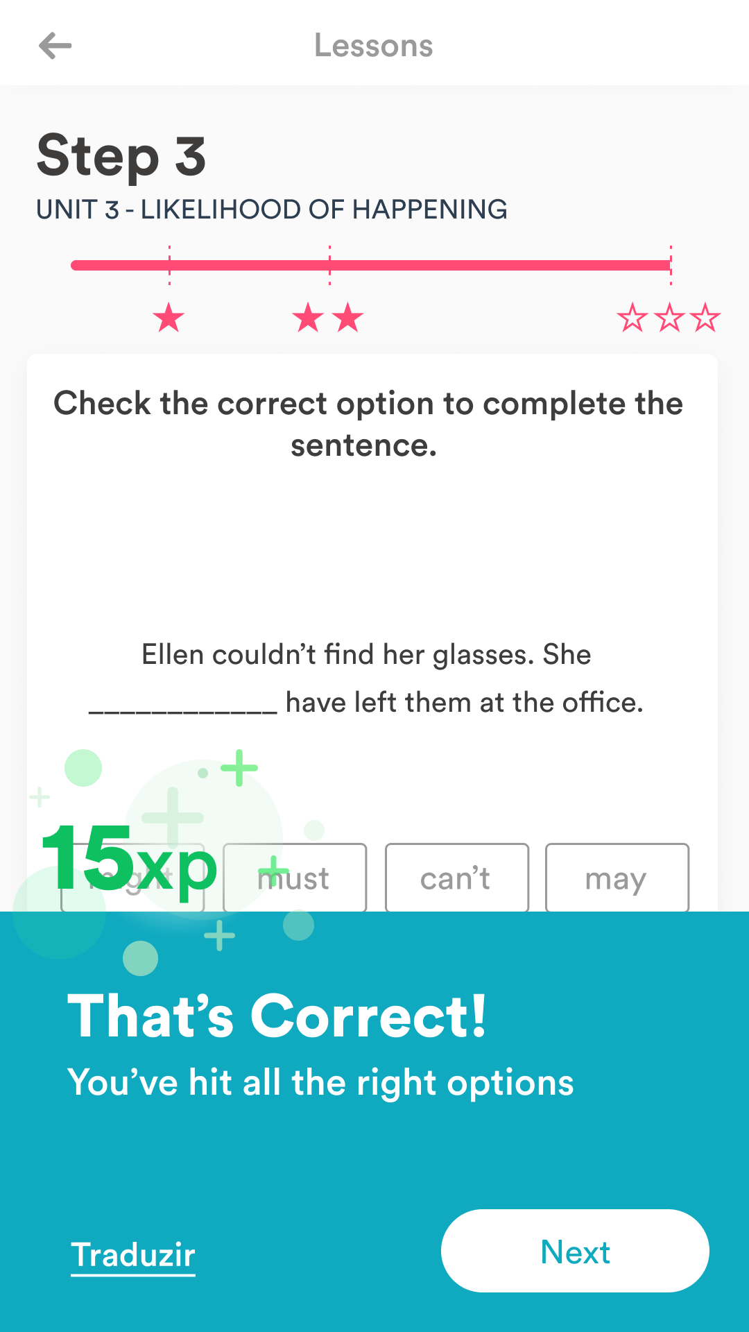
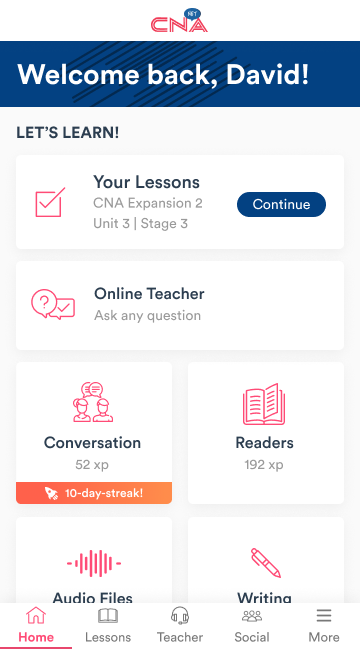
Final Designs
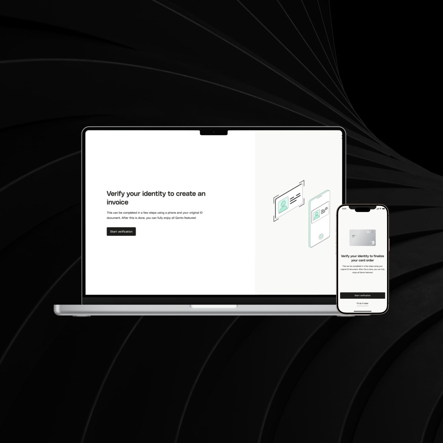
Home Page: Before vs. After
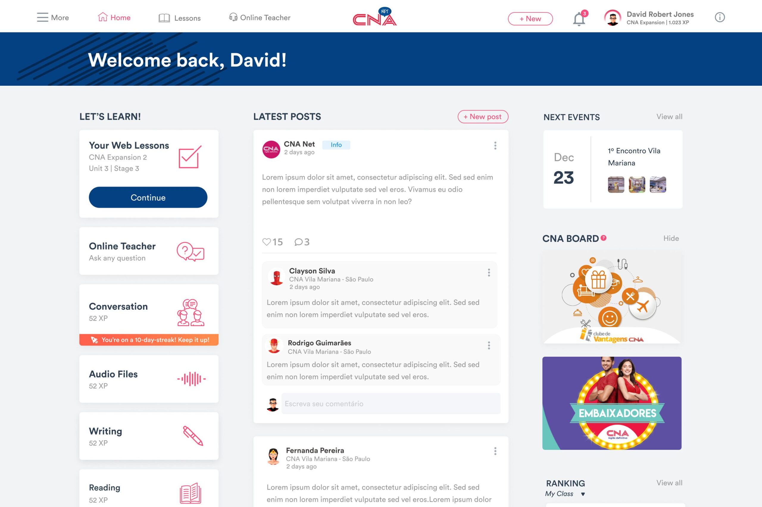
Desktop screens

Mobile screens
Conclusion
What have we learned?
- Testing with kids and creating products for them is hard. I mean, really hard! A lot of unexpected questions and the most important thing: raw feedback. If something's not good, they will say it to your face. This definitely helped us to see what we had developed in a very critical way.
- We, as a product team, learned A LOT about kids' behavior regarding technology. This was the perfect opportunity to deconstruct some stereotypes about children.
- Brazil is a huge country, so it's natural to identify a lot of differences between people.
What could have been better?
- The project could have been more agile and less waterfall. Small and continuous delivery would be a better approach since we would collect data from the "real world" as well.
- Although we shared every discovery with our development team, sometimes it was difficult to bring everyone on the same page. For the sequence of the project, it would be ideal to bring the development team not only to understand the data from users but to give insights and ideate together with us.
- Unfortunately, we couldn't visit schools in as many places as we wanted. We tried bridging this gap by doing some interviews via Google Hangouts, but we recognize it's not as good as going to the actual places where the schools are located.
Thanks for reading!
Selected Works